
Brutalism in web design, (not to be confused with minimalist and anti-design trends), is a style that focuses on simplicity and function rather than looks. It’s like a bare-bones approach to designing a website, where the layout and user interface are as simple as possible.
Brutalism is a daring style that stands out because of its raw and striking visual design, allowing designers to be unique and different.
Brutalist web design is characterized by its simplicity, functionality, and lack of aesthetic frills. It’s about delivering content in the most straightforward way possible, without the distractions of flashy graphics or complex layouts.
Below we’ll touch upon some key concepts using this design.
Minimal CSS
A core element to Brutalist web design is the minimal use of CSS. Text and images are meant to be the focal points of the website, combined with grids to provide structure.
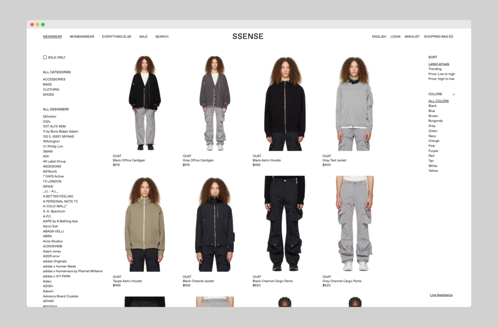
ssense.com, an e-commerce store for high fashion, demonstrates Brutalist design with their simple text and white background. This minimalist approach is often used in a more grid-like layout and text-focused design to emphasize the product images and brand names.
Intent through simplicity
Taking on the same principles of Brutalist architecture where raw materials are the focus of the structure, web design utilizes the same by relying on bare bones styling to place more emphasis on intent — often focused on functionality first, with visual aesthetics coming last (or not at all).
Choosing basic colors like black, white, and natural tones such as grey, tan, and copper further enhances the sense of solidity, resembling physical structures. Additionally, the use of rough and imperfect user interfaces with sharp edges contributes to creating an industrial feel for your website.
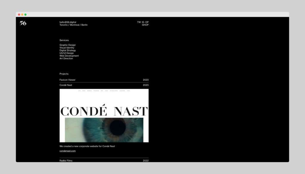
https://56.digital/, a Toronto based design studio, effectively demonstrates this pattern through the layout of their portfolio. Each company website is ordered in an accordion list that reveals the work on click. Visitors are able to focus their attention without distracting elements.
Effective, not attractive
While a stripped down interface may seem a bit lackluster to some visitors, websites who choose to utilize the Brutalist approach understand their users want a fast and straightforward way to use their site, without the added distractions.
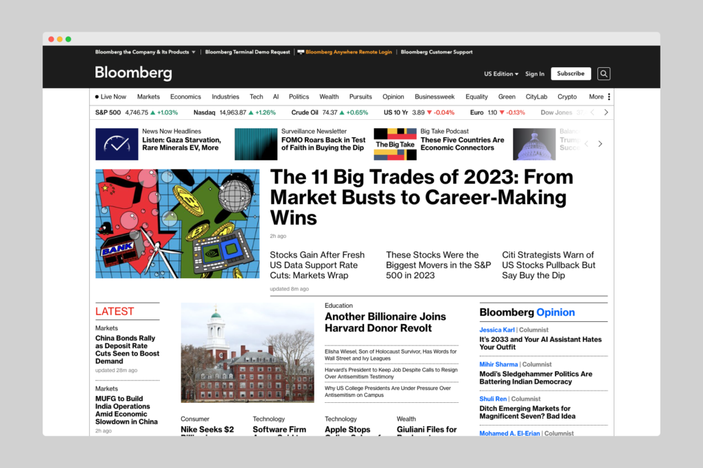
bloomberg.com is a great example of this through their heavy focus on text (news updates) and a grid like layout to provide a more newspaper style that resonates with their core audience.
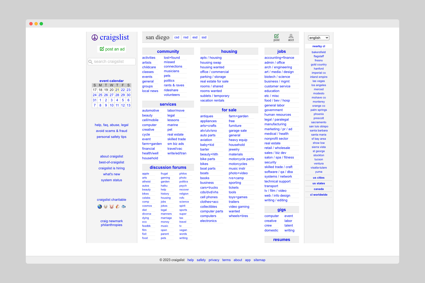
craigslist.org layout is simple and text-heavy, with a focus on functionality over aesthetics. This design choice is not accidental, but rather a strategic decision to accommodate the intent of its users — to buy, sell, or find something specific.
See more examples of brutalist web design at brutalistwebsites.com.